How to Build a High-Converting Landing Page From Scratch
You know that feeling when you click on an ad, land on a page, and immediately think, "Nope?" Maybe it’s cluttered. Maybe it’s confusing. Maybe it’s screaming at you with fifteen different buttons and you’re not even sure what you’re supposed to do next. That’s a landing page that’s working against its owner.
A good landing page does the opposite. It doesn’t shout. It guides. It focuses your attention, answers your questions, and makes taking the next step feel easy, obvious, and maybe even a little exciting.
We help businesses build landing pages that don’t just look pretty in a pitch deck, but actually convert strangers into customers. If you’re starting from scratch, here’s what it really takes.
Clarity Beats Cleverness
Too many businesses overthink this part. They want a landing page that feels edgy or “outside the box,” but visitors don’t show up for your creativity—they show up for a solution. If they land on your page and have to decode who you are and what you’re offering, you’ve already lost them.
A high-converting landing page starts with a headline that makes people think, Yes, this is exactly what I need. Not a pun. Not an inside joke. Not corporate filler like “Solutions for a Better Tomorrow.” Be direct. Be specific. People respect clarity more than you think.
Design for One Job
A landing page isn’t your homepage. It’s not a blog post. It’s not an About page. It has one job: get the visitor to take action.
Everything on the page should serve that job. The headline pulls them in. The subhead explains what’s in it for them. The copy backs it up with proof and benefits. The visuals reassure them that you’re legit. And the call to action? That’s your moment of truth.
Too many businesses clutter their landing page with extra links like navigation menus, unrelated promos, and social feeds, almost as if they’re worried visitors might get bored. Don’t give people an exit ramp. Every distraction is a leak in your conversion funnel. Keep them moving forward, not sideways.
Make It Feel Trustworthy
Even the slickest landing page falls flat if visitors don’t trust you. Think about it: You’re asking someone to hand over their email, their credit card, maybe both. They’re doing that on the promise that you’ll deliver.
So build in trust signals. Testimonials. Logos of companies you’ve worked with. Star ratings. Secure payment icons. Money-back guarantees if you have them. These are the subtle reassurances that tell people, Hey, this isn’t a scam, you’re safe here.
And here’s the thing: trust doesn’t come from design alone. It comes from the little details: clean grammar, professional images, consistent branding. A sloppy page raises red flags. A polished one keeps people leaning in.
Write Like a Human
Your landing page copy should feel like a conversation, not a sales pitch barked at high volume. Focus on your reader’s pain point, not your product’s feature sheet. Talk about what they want, not just what you’re selling.
Instead of listing ten technical specs, paint a quick picture of what life looks like when they say yes. People buy outcomes, not feature lists.
If you find yourself writing like a brochure, back up and ask: How would I explain this to a friend? That’s your copy voice.
Calls to Action: Make It Stupid Simple
“Sign Up Now.” “Get the Free Guide.” “Start Your Free Trial.” Whatever you want your visitor to do, spell it out in plain language and make the button impossible to miss. Not because your audience isn’t smart, but because they’re busy and distracted.
One call to action. Maybe two if your page is longer and you need to repeat it. That’s it. Don’t bury it under a wall of text. Make it big enough to tap on a phone without pinching and zooming.
Test, Learn, Repeat
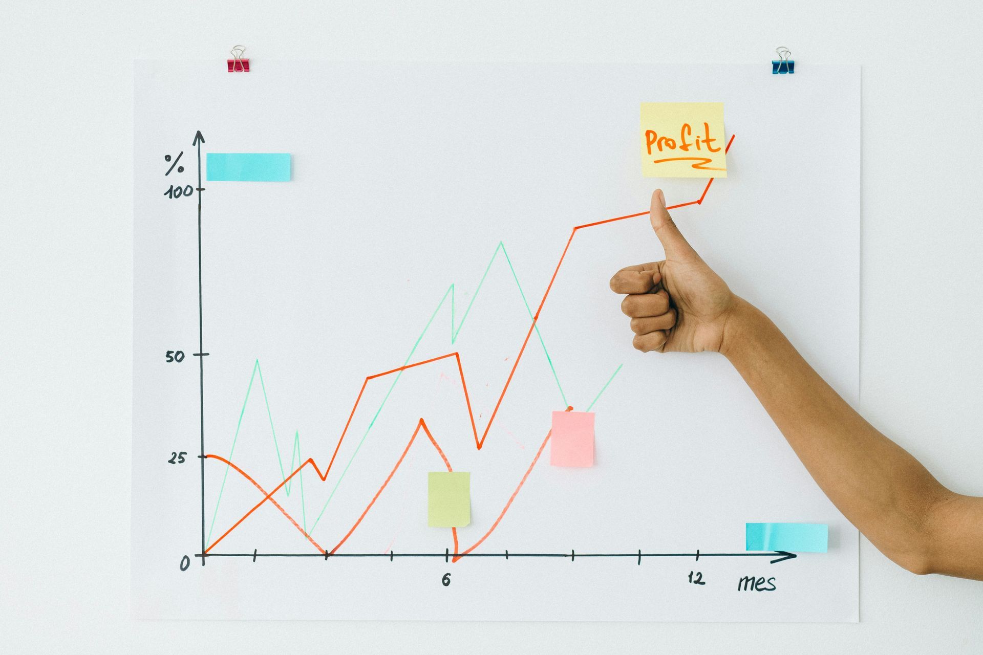
Even the best landing page isn’t done the day you hit publish. The smartest brands treat every page like a living experiment. Run A/B tests on your headlines, images, CTAs. Swap in a different testimonial. Tweak the length of your form. Small changes can unlock big improvements, sometimes overnight.
The difference between a page that converts at 2% and one that converts at 10% isn’t magic. It’s testing, learning, and tweaking until your page does exactly what you built it to do.
A Good Landing Page Pays for Itself
A well-built landing page doesn’t just sit there looking nice. It works for you 24/7, turning clicks into leads, browsers into buyers, and casual visitors into loyal customers.
At Right Tool Media, we don’t believe in guesswork design. We believe in clear messaging, smart strategy, and pages that earn their keep.
Ready to build yours? Let’s talk.